Viewing Options
map-projections.net offers some Viewing Options that affect the display of the projection images. Here, I’m going to explain what’s it all about and why I included them.
Note: The Viewing Options are not to be confused with the Mode of Comparison: Simple Mode / Expert Mode!
Those modes are explained in the sort hints.
Flat Oceans
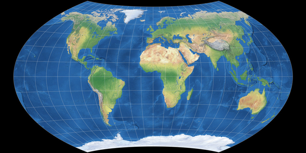

By default all physical map projection images are shown having a shaded relief ocean floor. Originally, I used this images simply because I like them very much. :-) However, as time passed I realised that this imagery might not be the best to emphasize on the characteristics of the different map projections. So I generated a new image set having oceans with flat blue tint and stronger graticule lines.
But because I just love the shaded relief ocean floor images I couldn’t bring myself to replace the old images with the new ones. So I simply added the new images as an option.
Use the Viewing Options menu in the upper right corner of this website: Check Flat Oceans box and hit Set.
In the compare section you’ll see the flat ocean images then. And of course, uncheck the box and hit Set again to recvert
to the shaded relief.
South Up
Why are world maps always shown with North on top and South at the bottom of the map?
It’s tradition. Nothing more.
And therefore, you sometimes might stumble across maps that have South at the top.
They are called rotated maps, upside down maps or reversed maps.
Or simply south-up maps which is the term I like best.
Those maps are often created by people who live in the southern hemisphere because they are fed up with being
at the bottom or for educational reasons, i.e. teaching the people that north-up maps are nothing but a conventional practice.
If you prefer south-up maps: No problem!
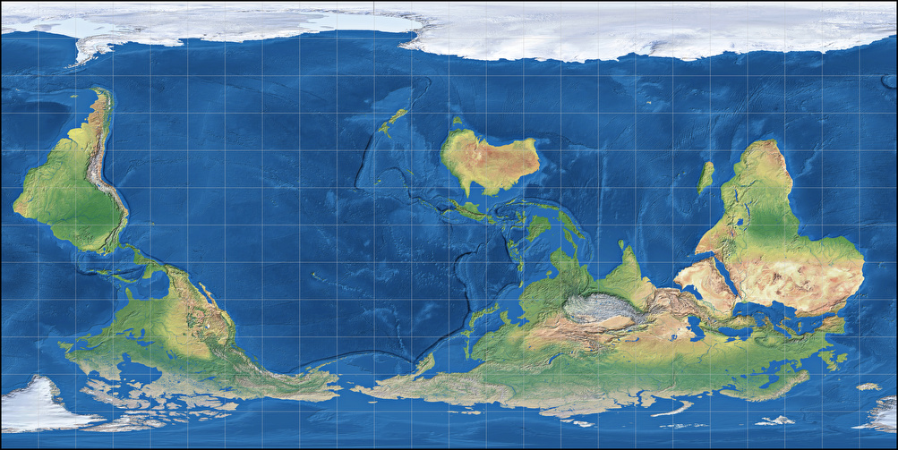
Just enable the South-up mode, and all projection images will be displayed upside-down.
Again, just check the option in the menu above and click Set.
However, this only works with web browsers that are not too outdated, for a very simple reason:
South-up mode uses the very same images that are loaded for the usual north-up display, but your
browser is instructed to rotate them by 180 degree. And unfortunately, old browser will ignore that instruction.
(And if the southpole isn’t on top in the two images provided here – well, then you’re using such an old browser…)
Nonetheless most of you will be able to view the upside-down maps.
Enjoy!
… one two more things
If you search the web for south-up maps, you might notice two things:
- Most of those maps are cylindricals, i.e. having a rectangular shape.
- Many of those maps aren’t center to the Greenwich meridian but somewhere in the pacific ocean.
I don’t have the slightest idea what might be the reason for #1.
For #2 I can merely guess: Maybe most creators of south-up maps come from Australia, and they don’t only want
to be on top, but in the (horizontal) center of the map, too.
And why not?
After all, a lot of maps that can be seen here in Germany are centred to 10° East. And I guess that’s not only
in order to display Siberia without interruptions…
Regarding the educational reasons mentioned above it’s a good idea to occasionally look at maps which are centered to
other parts of the world (not to mention that this is quite common in many countries anyway).
Unfortunately, I can’t display maps that are centered to a different meridian by simply adding an instruction for
the web browser. Instead I’d have to create a whole new set of projection images!
I don’t think I will ever do that. Sorry, but it’s just too much work.
So you have to put up with the representation as shown below, using two projections as an example. One of them complies with the usual practice to use cylindric projections for that, and the other doesn’t:
Plate Carrée projection, South-Up, centered to 150° East
Natural Earth II projection, South-Up, centered to 150° East
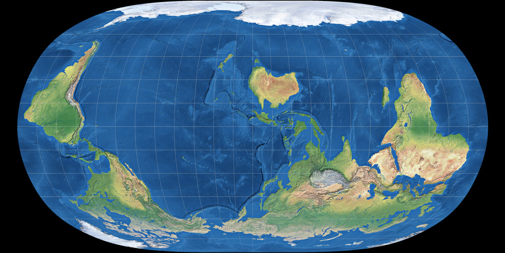
And yes, both image show the world we live in just as good (or bad) as the maps we are used to.
Comments
Due to spam posts, comments are now subject to moderation, which means they remain hidden until they are approved by a moderator.
5 comments
Nilson Becker
Sheamol
Alexandre Canana
Alexandre Canana
Waldir Pimenta
Tobias Jung
The Gedymin faces are fun to look at, but their practical value is too low to make me generate more than 300 images (which is a time-consuming and boring task).
Also, I won’t add labelled maps. The labels would either be distorted – see this example:
https://blog.map-projections.n…
– or I’d have to re-position them for every new projection that is added. Which is a thing that I’d love to do if working on this website was my full time job. Unfortunately, it isn’t. :-/
Waldir Pimenta
Tobias Jung
Tobias Jung
John
Tobias Jung
Maybe I could, at some point, add a d3-generated version of certain projections, like the one showing the customizable Wagner:
https://map-projections.net/d3…
As you can see, you can change the graticule lines there, or set a different map center.
Unfortunately, not all projections I’m listing on this site are available in d3.
John
JNS7
Tobias Jung
https://map-projections.net/si…
And it would be easy to create a South-Up, centered to 150° East image of Smyth. But the hard part are the names. (And I guess you are referring to country names?)
While it’s also easy for me to create an image with automatically placed labels, these labels WILL overlap and become illegible in areas with many small counties (e.g. Europe), so you have to do a lot of post processing, which can be done manually only (using the software that I have) and thus, takes a LOT of time.
So sorry, but I won’t do that for free.
Kind regards,
Tobias
Tobias Jung