My Projection Collection:
Compare Projections
Strebe 1995 vs. Strebe Asymmetric 2011
| Strebe 1995 | Strebe Asymmetric 2011 | |
|---|---|---|
| Creator | Daniel »daan« Strebe (1995) | Daniel »daan« Strebe (2011) |
| Group | Lenticular | Lenticular |
| Property | Equal-area | Equal-area |
| Other Names | — | — |
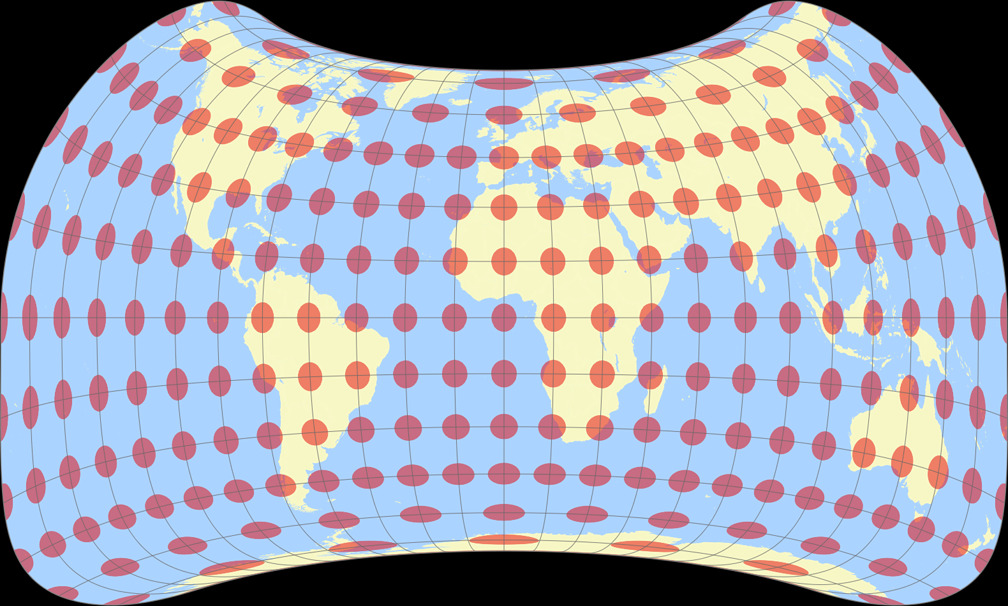
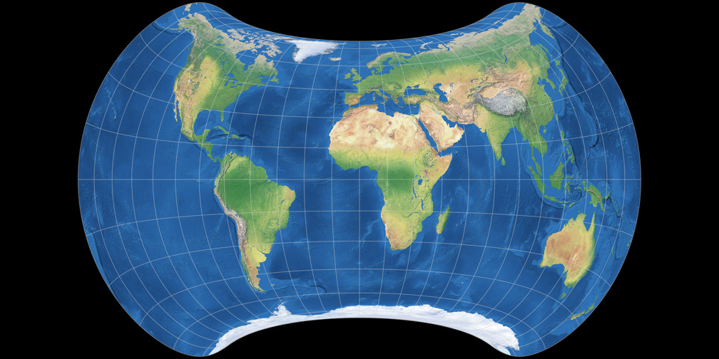
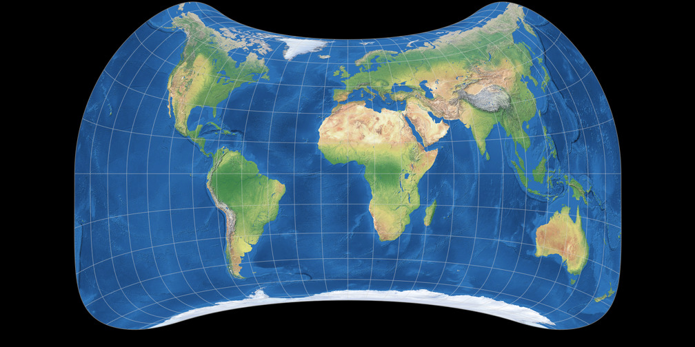
| Remarks | It’s something that’s not supposed to look too horribly unfamiliar, it’s not supposed to be sliced up with interruptions, and most importantly the major technique I used was to push the distortion the distortion into the Pacific as much as possible and preserve the shapes of the land areas, while also keeping the map equal area. (cited from an interview at cartographicperspectives.org.) Here on map-projections.net there’s an article about Strebe 1995 and 2011. |
Modification of Strebe 1995 in order to substantially improve Australia and New Zealand. Originally presented in the mapthematics.com forum. Here on map-projections.net there’s an article about Strebe 1995 and 2011. |
| recommended comparisons | Strebe Asymmetric 2011 | Strebe 1995 |
|
This pairing is among the list of recommended pairings – but why? Strebe Asymmetric 2011 is a modification of Strebe 1995. |
||
1. Comparison: Physical Map – scaled to fit
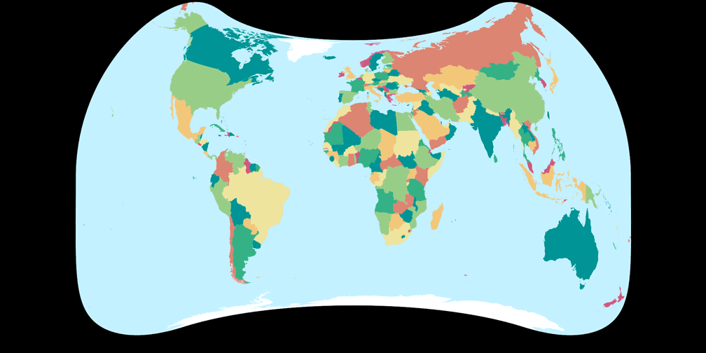
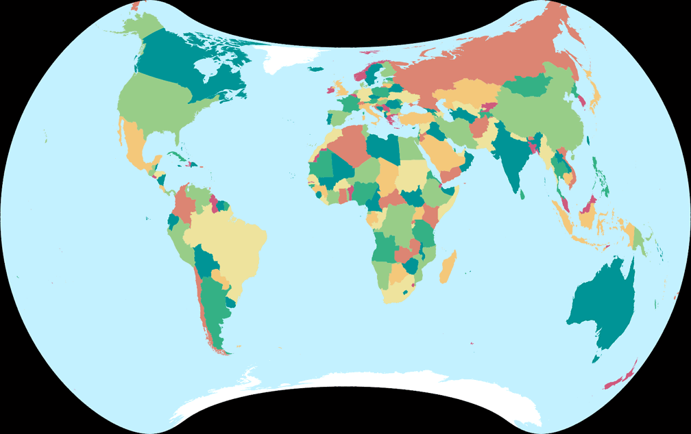
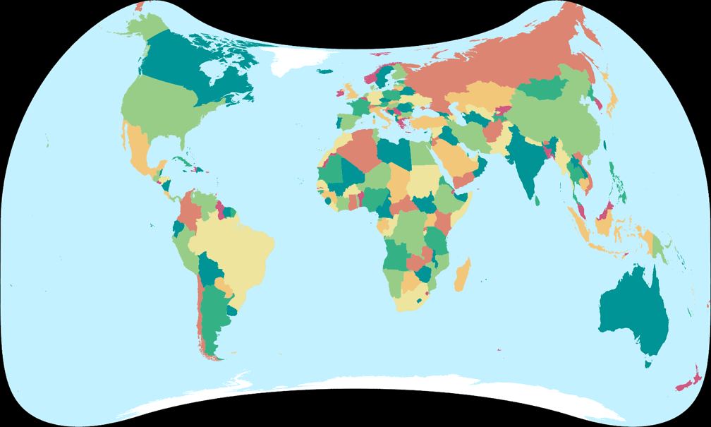
2. Comparison: Political Map – scaled to fit
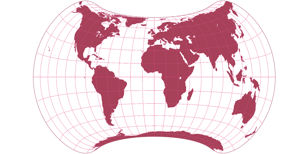
Strebe 1995
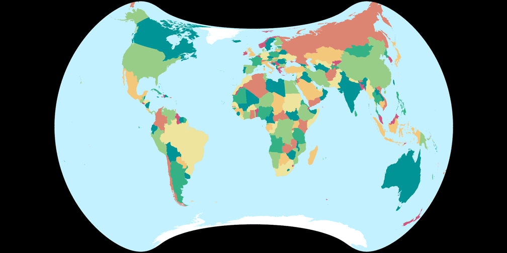
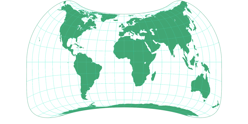
Strebe Asymmetric 2011
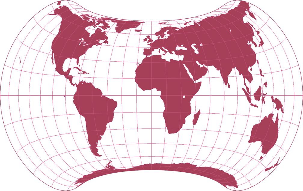
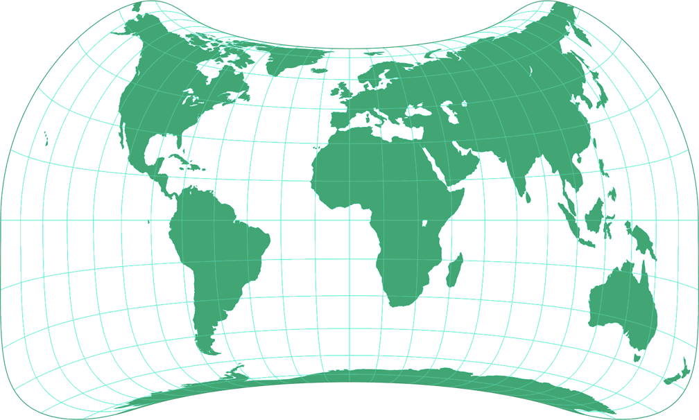
3. Comparison: Silhouette Map – scaled to fit
4. Comparison: Tissot Indicatrix, 30° – scaled to fit
Strebe 1995
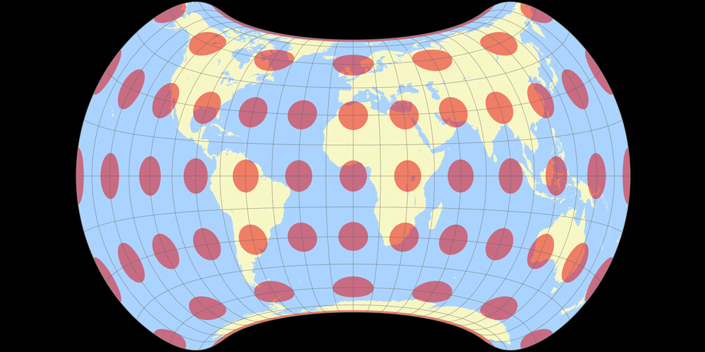
Strebe Asymmetric 2011

5. Comparison: Physical Map – scaled to same width
Strebe 1995

Strebe Asymmetric 2011

6. Comparison: Political Map – scaled to same width
Strebe 1995
Strebe Asymmetric 2011
7. Comparison: Silhouette Map – scaled to same width
8. Comparison: Tissot Indicatrix, 30° – scaled to same width
Strebe 1995
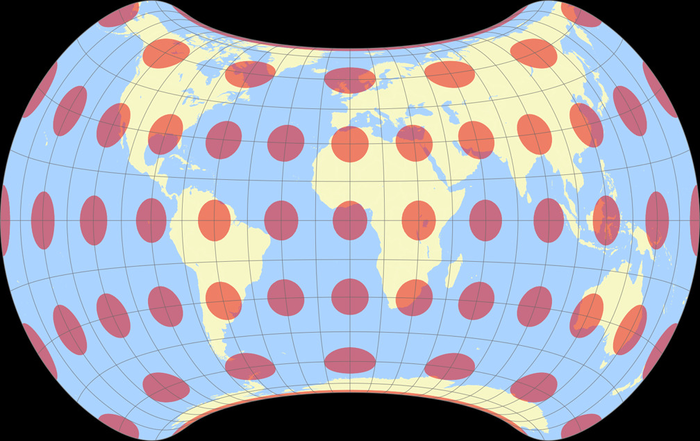
Strebe Asymmetric 2011

9. Comparison: Tissot Indicatrix, 15° – scaled to fit
Strebe 1995
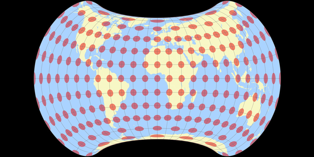
Strebe Asymmetric 2011
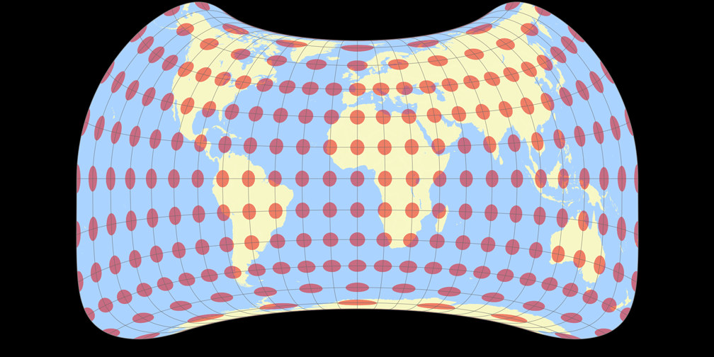
10. Comparison: Tissot Indicatrix, 15° – scaled to same width
Strebe 1995
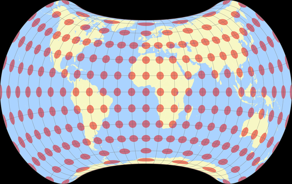
Strebe Asymmetric 2011
