Patterson Cylindrical Projection
– Introduced 2014 by Tom Patterson, Bojan Šavrič and Bernhard Jenny.
OK, we can do this one short and sweet.
Each map projection has some kind of distortion. You can either keep the proportions of size
and will end up with severe distortions of the shapes (an equal-area projection).
Or you can try to show the shapes correctly but will end up with severe distortions of areal relationships (conformal).
Or you can balance out the distortions and create a compromise projection, which will
have both distortions of proportions and shapes, but to a lesser extent as in the aforementioned types
of projections.
Cylindric projections, which will always produce rectangular-shaped world maps, lead to very strong distortions.
That’s why I don’t like them very much, und I do think that in most cases, you’re better off with choosing
a different type of map projection, e.g. a pseudocylindric or a lenticular projection.
(See Groups of map projections if you’re not familiar with these terms.)
But of course I have to admit that there are applications in which a rectangular map is helpful or even mandatory: The best example is, of course, the Mercator projection, which was the only map used in navigation for centuries.
Moreover, many people seem to want rectangular maps: Just try to find a wallpaper world map,
and you’ll see that a lot of wallpaper maps you can buy use a rectangular-shaped projection.
And regrettably, that results in the Mercator projection being seen in general use world maps for which
it simply wasn’t designed. (And that again lead to the dreadful Peters projection, but that’s a topic
that I won’t cover now…)


Common cylindric projections: Mercator, Behrmann, Gall-Peters, Miller 1
Uuh, I said something about short and sweet, didn’t I? – Here goes:
In 2014, Tom Patterson, Bojan Šavrič and Bernhard Jenny introduced the
Patterson Cylindrical Projection, which is based on the Miller 1 projection by Osborn Maitland Miller (1942).
They chose an approach that, to my knowledge, has never been used before:
The distances between the lines of latitude steadily increase moving from the equator to 55 degrees,
level off around 60 degrees, and then decrease toward the poles. Of course, polar areas still
are shown much larger than they are: Greenland seems to be larger than
Australia, while in reality, Australia is about three and a half times bigger than Greenland.
Nonetheless, in my opinion the procedure leads results in the best cylindrical
compromise projection that has been developed
so far:
Usage
Note: I’m no cartographer. The recommendations below are made by a complete layman!
Did I mention that I’m not a big fan of cylindric projections? Oh yes, I did.
So my first recommendation is: Verify if you really need a rectangular map or if a different
shape might fit the purpose of the map better. So in case you really need a cylindric map –
let’s see how Patterson works out for different kinds of maps…
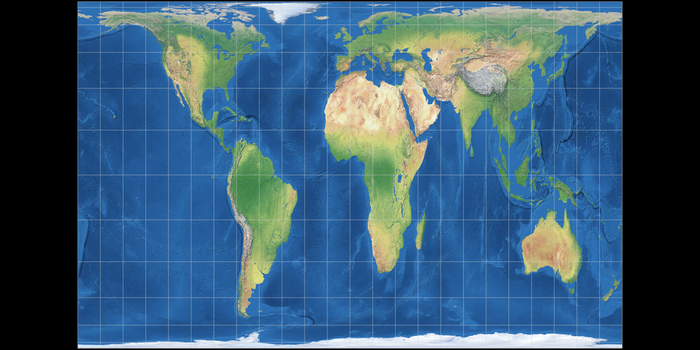
Political Map
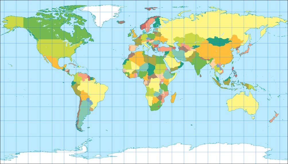
The Patterson project works quite well for an political map.
Of course, the downside is that Europe is in an area of the map which gets significantly exaggerated, so using
it you might risk being accused of eurocentrism…
Don’t say I didn’t warn you!
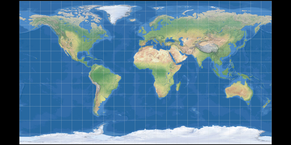
Topographic Map
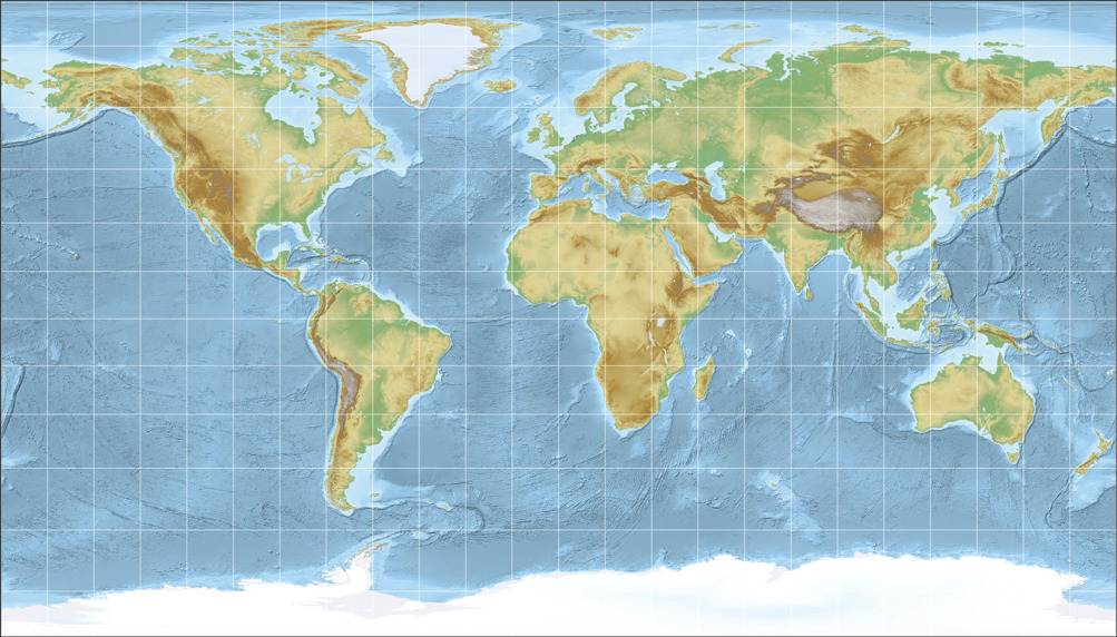
Well… my opinion:
If there’s a single kind of map which really doesn’t work with cylindric projections, it’s the
topographic map. I can’t even tell why I think so… it just feels wrong to me.
But at least the Patterson projection is better for topographic maps than the other cylindric projections provided above.
Climatic Map
In my opinion, a climatic map is not an advisable application for the Patterson projection.
After all, the climate zones are related to the latitudes: As a rule of thumb, you can say that it gets colder
the farther you move away from the equator – but I guess, you already knew that. ;-)
The varying distances of the lines of latitude, which are great for a better display of the shapes, now are
more of a hindrance than a help. Especially regarding the fact that climate maps are often shown
without a graticule (that’s why I omitted it in in the image).
So, better use a different projection here. In case you like the aspect ratio of the Patterson projection,
try the Equirectangular projection with the standard parallels set to 35.6 degree. Or hey, here’s an idea:
Try not using a cylindrical projection! ;-)
Other thematic maps
There’s a hell of a lot of thematic maps – after all, you can stuff about any kind of statistic data
into a world map. So it’s bold to try to recommend any world map projection for all these thematic maps.
And so, I won’t do this.
Nonetheless I think that in many cases it’s not that important for thematic maps to keep certain metric properties such as equivalence or conformity. Moreover, resulting in a rectangular-shaped map, cylindric projection might fight quite well into reports, or atlases (where often a bunch of thematic maps are shown consecutively on a few pages).
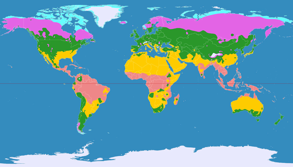
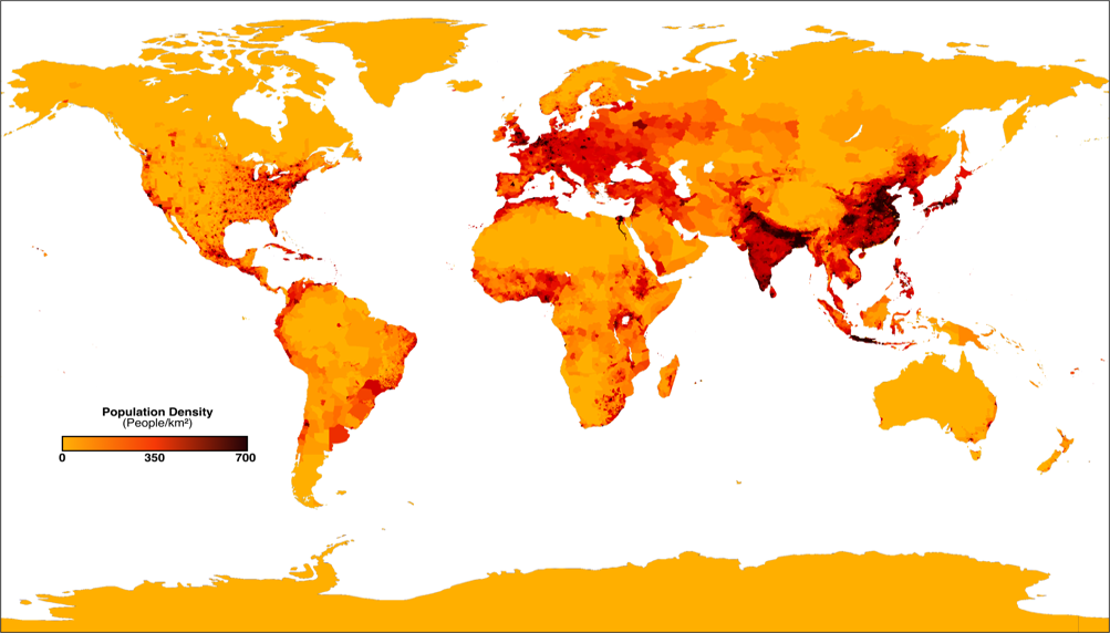
But sometimes, equivalence is important! For example, the population density is misrepresented on an map that’s not equal-area. Therefore, I think that the Patterson Cylindrical is an inappropriate projections for maps like this.

On the other hand, the time zones map is a very good example for maps that benefit from cylindric projections: Just like the climate zones are related to the latitudes, time zones are closely related to longitudes, so it might be a good a idea to use straight lines of longitude when you drop the graticule (which you should do on a time zones map since it’d add confusion).
Before I’m starting to bore you, let’s finish quickly with two more examples, that benefit from the Patterson cylindrical projection:
On the airline traffic map, it’s convenient that some areas having large volume of traffic (i.e. the traffic between Europe and North America)
are enlarged so the lines won’t blur into each other more than they already do.
And the »Early Human Migrations« map shows an advantage that is of course inherent in all cylindric projections: It doesn’t matter if you
shift the central meridian (to 160° East in the image), the shape of the continents doesn’t change.


Decorative Element
Sometimes maps don’t need to transport information of any kind but are used as a purely decorative element.
In this cases, the maps are often shown without graticule or neatlines (the outer borders), Antartica gets cut off, and mostly
there is some kind of color gradient and shadow cast. Many news programs use these maps as background image.
I’m no graphic designer, so please excuse that my own attempt of a decorative map might look a bit clumsy…

Since a decorative map often dismisses visual guides such as graticule and neatlines, the use of a cylindric projection
seems to commend itself.
Indeed I think the Patterson Cylindrical projection looks great for this purpose, definitely better than the
projections used by the two most important german news programs (which are, I think, Miller 1 and Braun stereographic).
So I do hope that Pattersons projection will be used for decorative maps a lot!
Conclusion
The Patterson projection is a very good cylindrical which should be considered whenever you need a rectangular map. It still exaggerates the polar areas but to a lesser degree than comparable projections, and preserves shapes of the land masses very well.
And, as a side note, when you really need an equal-area map, don’t choose a cylindric projection…
Remark
Patterson, Šavrič and Jenny developed another projection, the Compact Miller. It’s an intermediate production step which reduces the area of polar regions compared to the original Miller 1 but to a lesser degree than the Patterson projection does.
Recommended Comparisions
- Miller 1 vs. Compact Miller
- Miller 1 vs. Patterson
- Compact Miller vs. Patterson
- Brauns Stereographic vs. Patterson
- Equirectangular Projection (standard parallels on 35.6°) vs. Patterson
- Mercator vs. Patterson
- Gall-Peters vs. Patterson
- Behrmann vs. Patterson
Links
- Introducing
the Patterson Cylindrical Projection
- World Political Map
A free, editable, beautiful and very large world map, which is available in Pattersons Cylindrical Projection (and in Natural Earth and Natural Earth II as well).
Update-Hinweise
The article was updated on June 4, 2016. Changes include:
-
The political map image was replaced by a new one which I liked better.
The old image is still available. - The population density map image was added and replaced the previously used net primary production (NPP) map image. The NPP map image is still available.
- New examples: Airline traffic and timezones map images.
Back to Selected Projections • Go to top
Comments
Due to spam posts, comments are now subject to moderation, which means they remain hidden until they are approved by a moderator.
3 comments
Michael Ossipoff
Is there discussion regarding the motivation behind that particular formula?
Michael Ossipoff
It seems to me that it was in Snyder's book _Flattening the Earth_ that it was mentioned that there was a Russian cylindrical map that used Mercator up to some high latitude (maybe lat 70 or 75), and then switched to Cylindrical Equidistant, keeping the y-scale as it was at the switch-point.
That combines Mercator's conformality with a reduction of Mercator's biggest magnifications, and it allows the entire Earth to be shown.
That map almost surely requires more vertical space than Patterson, and might not be as suitable for showing the entire Earth on a book-page map.
Would you consider adding that projection?
I don't know if it would be possible to find an image for it. I don't think Snyder showed it.
But would you be able to graft those two cylindrical projections together?
One could look up, in _Flattening the Earth_, what the transition-latitude was. In that way, one could also find out the map's name.
Or one could just choose a convenient transition-latitude. Making the transition at lat 70 would include nearly all of Europe in the Mercator zone. Making the transition at lat 75 would include all of Europe and more of Siberia and Northern Canada.
That projection would be for when someone wants a cylindrical, conformal map, but also wants to show the entire Earth while limiting the arctic magnification.
By the way, if there's any difficulty finding a conveniently-usable image for Gall Isographic, of course one could make that projection by merely expanding Square-Grid (Plate-Carre) Cylindrical-Equidistant vertically by a factor of the square-root of 2.
Michael
Tobias Jung
As for the Gall Isographic, I will be able to generate an image using G.Projector. It will be added sometime soon…
Tobias Jung
The good news is, I’ve found out that the projection you’re talking about is the Kavrayskiy I, and that I will be able to generate the images needed in the projection comparison.
The bad news is: In my opinion, it still looks quite horrible… ;-) Well, at least speaking aesthetically; although it IS an improvement compared to Mercator, in case it’s acceptable to ditch conformity in areas that are mostly unpopulated.
In advance, here’s one image:
http://tobiasjung.name/forumbi…
Michael Ossipoff
Also, though, speaking for myself, magnification doesn't bother me, it could still be desirable to show the entire Earth in a reasonable page-shaped space, and Kavrayskiy doesn't do that. Probably Patterson does that.
What Kavrayskiy _does_ offer is: Conformality over the inhabited part of the Earth, and the ability to show the entire Earth (but only with an exceptionally tall map).
But I still like Kavrayskiy because it offers that. I like conformality, and cylindrical maps have many important and useful properties (Check my New Year's Day posting at daan Strebe's Mapthematics forum).
So, with Kavrayskiy, one can have conformality, cylindrical-ness, and the possibility to show all of the Earth.
...but yes, I realize that it doesn't get rid of Mercator's main popularity-losing fault--the very large arctic and antarctic magnification. ...and that Kavrayskiy isn't going to gain more acceptance than Mercator.
You know how to work with the software, and print-out any map you want. I bet you have some varied and interesting world maps on the wall. As for me, on my wall I just have two store-bought maps. ...in two widely-sold cylindrical projections. ...but that's ok, because, as I was saying, cylindrical maps have many important and valuable properties. The maps on my wall are the widely-sold Mercator and Gall Stereographic. Though Gall Stereographic isn't conformal everywhere, it's conformal on the parallels halfway between the polls and the equator.
Patterson, it seems to me, does what Gall Stereographic and Miller do, better than they do. It could replace them.
Michael
Tobias Jung
the document "Introducing the Patterson Cylindrical Projection" (see the link at the end of the article) should cover your questions. Or do you feel that there’s something missing in that document?
Regards,
Tobias
Michael Ossipoff
Thanks--It hadn't even occurred to me to look at that link. It answers my question. The y-scale changes are done seamlessly and gradually with a single polynomial formula for y.
The Patterson is a great idea. It keeps the map compact, without so much arctic magnification, but also without a lot of shape-distortion.
Of course sometimes someone could want a maximally simply-constructed map, or a linear map for easy position-finding on a data-map, in which case equidistant parallels would be better.
For a Cylindrical-Equidistant, I prefer Gall's Isographic to the familiar square-grid version (Plate Carre?), because it balances its shape-distortion between equatorial and arctic regions. Plate Caree flattens Greenland a _lot_.
Suggested maps to add to the comparisons:
Gall Isographic
Apianus II
Apianus II is a very under-appreciated map. It's linear, making it a very good choice for data-maps, while having the realistically-round elliptical shape. It's also maximally simple in its construction, an equidistant pseudocylindrical constructed in an ellipse.
Apianus II's globe-realism and its great construction/explanation simplicity make it an ideal classroom map.
It would be of interest for people to be able to do a toggle & overlay comparison between Apianus II and Robinson. They'd find that Apianus II has only slightly less shear-distortion and departure from verticality than does Robinson.
While Robinson has the property of pseudocylindrical-ness, Apianus has that, and additionally has the useful linearity property, and doesn't have Robinson's unrealistic flat poles...but still is nearly as upright and shear-distortion-free as Robinson, with better-proportioned equatorial continents.
By the way, your projection-comparison website is a _great_ idea. ...something that's been much needed. Thanks for that!
Michael Ossipoff
Tobias Jung
Well, I should (and will!) add the note that the formula can be found there…
> The Patterson is a great idea. It keeps the map compact, without so much
> arctic magnification, but also without a lot of shape-distortion.
Agreed! :-)
> Suggested maps to add to the comparisons:
> Gall Isographic
> Apianus II
The Apianus II is already available, but listed as »Apian II«.
I know that, having about 150 projections available currently, it’s hard to find a certain projection that you’re looking for. I will have to think about how to make this a bit easier…
As for the Gall Isographic: Great idea, it will be added soon.
> Apianus II's globe-realism and its great construction/explanation
> simplicity make it an ideal classroom map.
Well, if you ask me, there should be at least two world maps in every classroom:
One with a pointed pole and one with a pole line; and one of them should be equal-area. For example, if Apianus II is one of them, the other one could be Wagner VII. (But of course, there are probably a lot of other pairings that might serve equally well).
Trouble is, nobody asks me. ;-)
> It would be of interest for people to be able to do a toggle & overlay comparison
> between Apianus II and Robinson.
So, this already is possible:
http://map-projections.net/c/p…
> By the way, your projection-comparison website is a _great_ idea.
> ...something that's been much needed.
Thanks a lot! :-)
Regards,
Tobias
Michael Ossipoff
Notice that Apian portray's both Greenland's and Africa's shapes more realistically than does Robinson.
I should add that, of course, Apian II could be vertically-expanded to move its conformal point (on the central meridian) up to mid-latitude, to balance low-latitude and high-latitude shape-proportions.
It's inevitable that a point-pole map like Apian is going to create less scale-disproportion for the continents than would a flat-pole map. ...along with less area problems.
But sure, for non-conformal maps with reasonable areas, when it comes to freedom from shear-distortion, the curved-extended-pole maps, such as those from Wagner, and from daan Strebe, seem to be the winners. ...but of course only for when one is willing to give up linearity, and the globe-realism of point-poles, and maybe some simplicity.
Michael